At Relias, the hierarchy section is how clients structured their organization within the platform. Every organization has their own system for how they manage things. Largely the role for hierarchies is to handle reporting, auto-enrollments, and some permissions.
Long term our goal was to consolidate several sections we use to organize users into something called “User Groups” and we’d shift most of hierarchies’ functionalities over to that. It would also involve an improved code base and work better across the entire platform.
That, however, was an extremely large project that was going to involve multiple teams and take an extended amount of time. I was working on that project as well, but while we kept an eye on the long term, in the short term hierarchies needed improvements.
For example, the first thing I addressed when put on the product was to define the terms we used and made sure they were consistent. The term “hierarchy” was thrown around a lot to mean a lot of different things.
So, I decided what we had been interchangably referring to as “levels” or “hierarchies” would definitively be “hierarchies.” And then we would change the name of the section from “Hierarchy” to “Hierarchy List,” which would clear up confusion as to what we were referring to and bring the verbiage in line with what we use elsewhere in the platform.
As far as functionality we had a number of problems:
1) People didn’t know what “hierarchy” is.
2) The hierarchies themselves would populate their information beneath the table making it rather hidden.
3) To make changes the users were given a very confusing warning modal.
4) There was a drag and drop function that didn’t work


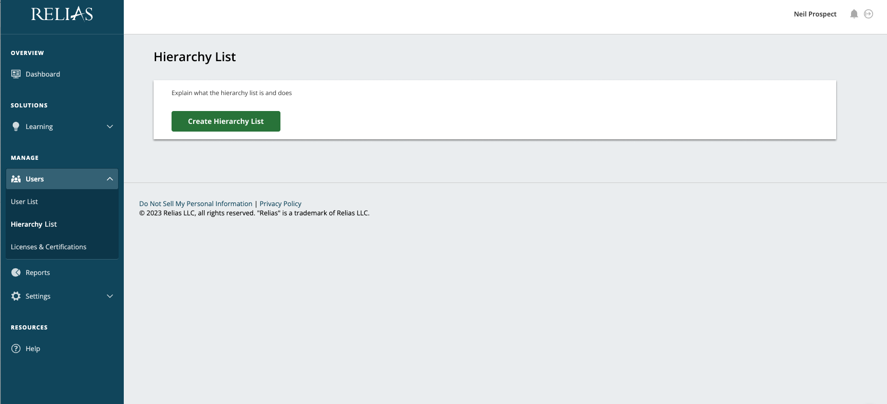
To solve the first problem of users not knowing what any of this is, I put forward a page that would explain it to them upon their first visit. I didn’t have text from product yet, but it was such a small thing that could make a world of difference. Client Services were fans of the idea.
For this overhaul we focused on two main flows: adding a new hierarchy and adding and removing users from each hierarchy.
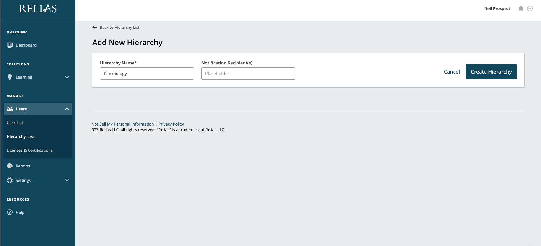
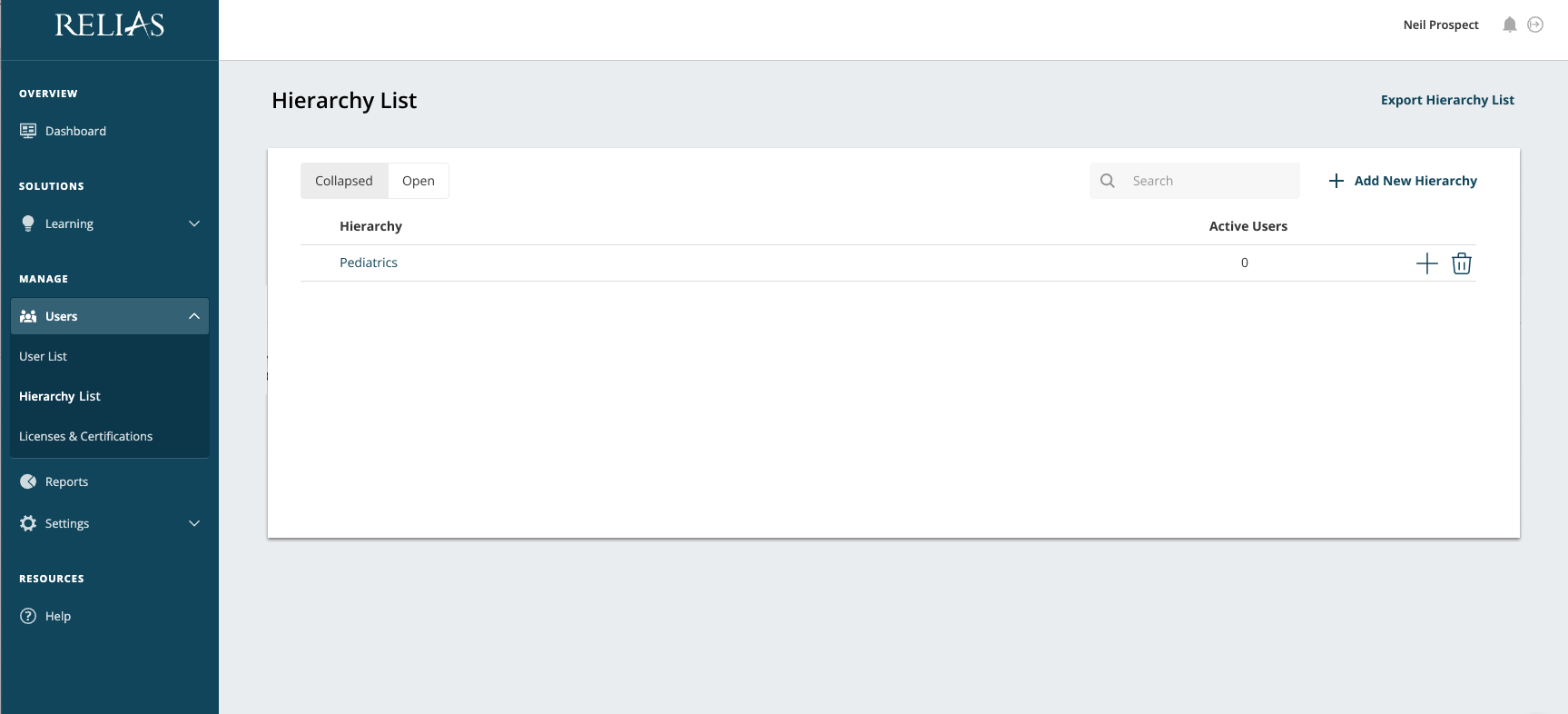
When the user first enters the hierarchy list, a hierarchy is already created for them. So, for the flow I had them enter the default hierarchy to rename it. Then to create a new hierarchy and new sub-hierarchy. The gallery below includes each step along the way.
This is the latest version that was completed after two rounds of testing, with some problems still being sorted out. The goal was to maintain all current functionality in a more modern design that was consistent with the rest of our platform and would keep as much information and interactions in a single place.


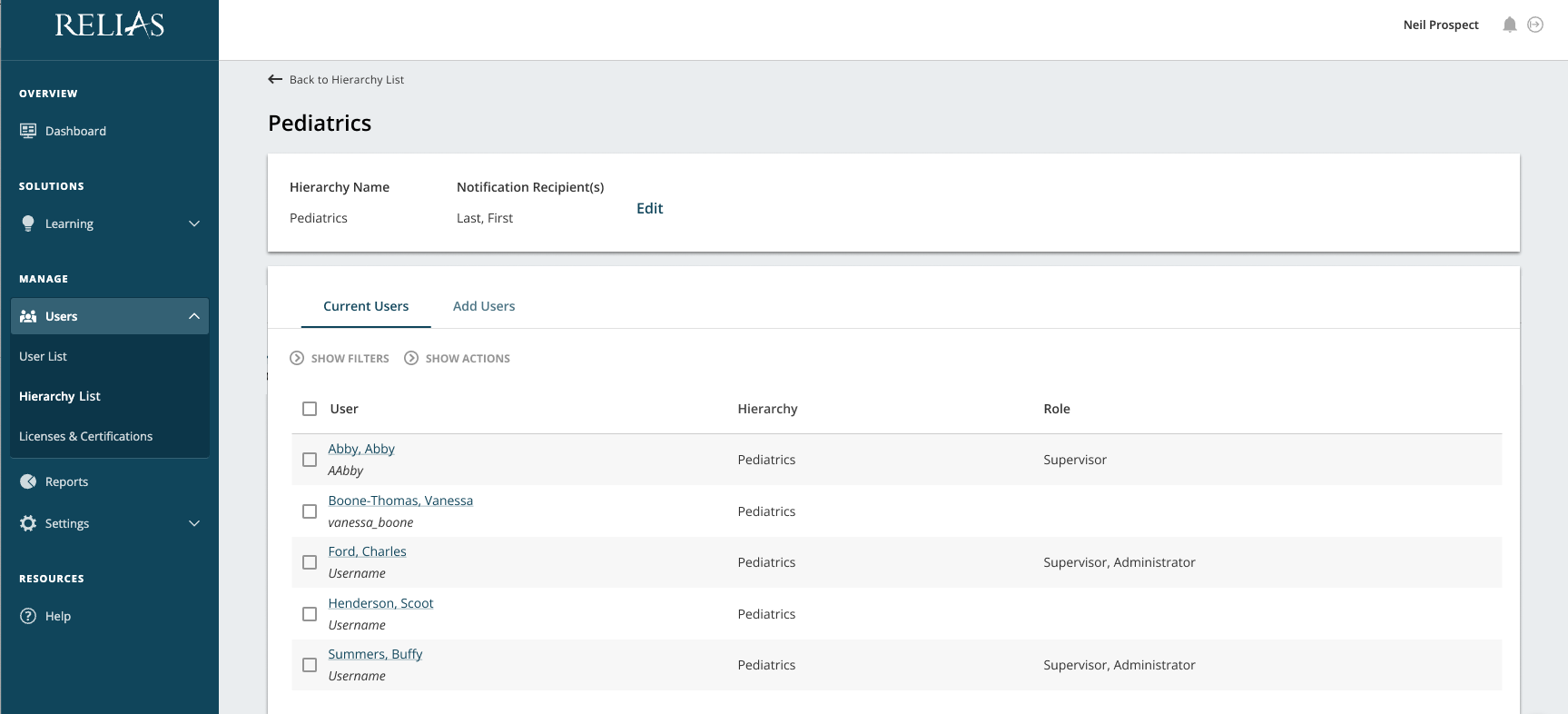
One of the hardest problems to solve for this flow was how to allow users to edit the hierarchy name and notification recipients even though any buttons to interact with those fields wouldn’t apply to the “users” section beneath it which had its own form of interaction.
Originally, they were much more connected. In an earlier version of the design this wasn’t an issue because we were planning on using autosave. However, we got word from our engineers that autosave created a whole slew of complications and when looking at the larger design it would cause greater confusion.
My initial run at fixing the problem was simply to add buttons that directly affected the two main fields in line with them. I wasn’t the biggest fan of this idea, but it was the best I had at the time, so we decided to test it. As expected there was a lot of confusion and users simply didn’t understand what the buttons were for or their limited effect.
I iterated on the design and seperated the page into two sections and in our next round of testing, it was clear that this was an effective change. You can see the change in designs below.


Our second round of testing revealed another problem. Users weren’t quite sure what the kebab menu was for. I had placed adding a sub-hierarchy and deletion in there, so we could provide a way for users to do these actions from the main list. In the old version both were handled on the edit page and sub-hierarchies were determined by drag and drop.
Keeping those functions in the new design was complicated and a kebab menu seemed like a safe place to put them while allowing for future features we might want to tag on. Well, it became clear through testing that the old adage “out of sight, out of mind” applied here.
While users would figure it out eventually, they would be lost at first prompt. My pitch for the next interation was to replace the kebab with icons for the two functions.
Another change made after the second round of testing (that’s already present in the above wires) was to include an extra dropdown in sub-hierarchies that would allow users to shift which hierarchy was its parent.
This was a problem that was particularly difficult to solve, that I at first intended to completely leave to the next round of iterations after we had released the “mvp",” but testing made it clear that while not a prime interaction, it was of a higher importance than expected. This would be an “mvp” version of that functionality that future iterations would refine and expand.
The second major flow I focused on was adding and removing users from a hierarchy. Below there are two galleries, the first showing adding a user and the second showing removing a user. Both of these sets of wires (along with delete and filters) are part of a single prototype, but with flat wires it is far clearer to separate them.
This flow probably went through the most changes before getting to a single round of testing. Initially the interaction took place in a modal, then a slide in, then completely separate pages, then combined on a single page until we came to the tabbed navigation.
This allowed free access to all the possible information while having a clear path for interaction and kept consistent with our design patterns throughout the platform.


An interesting thing we discovered through testing is that while appreciated adding and removing users within the hierarchy itself was not a primary interaction for our users. When our users wanted to add, remove, or move a user to another hierarchy, the most common response was that our users would do it from within the specific user’s profile.
That just goes to show the value of research and discovery. Unfortunately, that is not something that always gets the company support it deserves in the early stages. Still, the interaction went completely smoothly in our testing, so that’s a win. My goal was to try to get this update out as quickly as possible and then continue releasing quick iterations and improvements while shifting focus to user groups.
With a few tweaks I would support this design being released and moving forward from there. Especially, given that most of what we discovered would have the largest improvements on this design were engineering upgrades. Unfortunately, the team was moved onto a different emergency project before this could be fully released.


